Summary
ALT text is a hidden description for images, helping people who can't see them understand what's there. It's also useful if images don't load or for search engines. Good ALT text describes the image and its purpose, keeping it short and to the point. You only skip ALT text for purely decorative images. While computers can help, always check their suggestions to ensure the description is accurate and helpful.
Welcome to this deeper-dive series of blog posts! I’ll be digging in to some accessibility topics that relate to my presentations on accessibility, with the goal of providing you with information and resources to make your workplace more accessible. The first post in this series is on Writing ALT Text for Accessibility.
What is ALT Text?
It’s a specific property that can be set on an image for use by assistive technology – whether that image is on a website or Content Management System (CMS), a document, an eLearning module, and more. ALT text, or alternative text, describes the meaning of the image in context so that users with limited or no vision can understand the information being shared.
ALT text has other uses as well, such as for slow bandwidth connections and search engine optimization. If an image fails to load over a slow connection, ALT text will display on a page instead, and search engines use image ALT text to better understand the content on the page.
Today we’re going to focus on writing ALT text for our images in any online setting.
What Makes Good ALT Text?
Great ALT text conveys both meaning and context – what is happening in the image itself, and how that relates to the rest of the content on the page. Don’t stuff your ALT text with keywords, thinking it will improve your search engine rankings. You’ll actually rank better with genuine, descriptive ALT text that naturally includes relevant keywords.
Good ALT text is shorter than a Tweet – 250 characters or less is a best practice. That’s not to say ALT text can’t be great with fewer or more words! Don’t include the words “picture of” or “image of” – a screen reader will do this for the user already. Also, avoid including image credits (such as an illustrator or photographer) in the ALT text – the appropriate place for this information is in an image caption.
Subjective or Objective? You’ll see advice going both directions, but in my personal opinion, if a subjective description better conveys the meaning of the image for the user, write it that way! You are the author of your website or document, and you chose the image for a particular reason, to convey a specific meaning. Don’t let that meaning slip away from an assistive technology user just because you are trying to describe the image as objectively as possible.
When can I skip ALT text? When the image is purely decorative and has no other meaning or context, that image does not require ALT text. Additionally, the user experience is often better when you skip ALT text on decorations. Imagine a screen reader user trying to learn from an eLearning module that has ALT text on decorative images, as well as meaningful ones – it would be possible to lose the important information in the clutter of ALT text.
How Can I Practice?
This is one of my favorite interactive activities during a presentation – showing an image and letting the audience practice writing the ALT text. ALT text improves as you get more input from more viewers of the image. Everyone will see or interpret something different from an image, and you can practice writing better ALT text in the same way, by getting additional opinions. What did you miss in your description that someone else saw? Is that additional information important to understand the image or its context?
Wait, can’t this be done automatically? Not quite! Although technology, especially generative AI language models like ChatGPT, is getting better at recognizing what an image depicts, algorithms alone cannot understand what an image means within the context of the overall content. Use AI to practice and get ideas for ALT text improvement, but never rely fully on automated tools without double-checking the output.
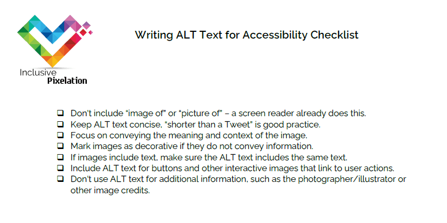
I Need a Checklist!
Click the checklist image below to download a PDF version.
Sources and Further Reading:
In Summary
ALT text is a hidden description for images, helping people who can't see them understand what's there. It's also useful if images don't load or for search engines. Good ALT text describes the image and its purpose, keeping it short and to the point. You only skip ALT text for purely decorative images. While computers can help, always check their suggestions to ensure the description is accurate and helpful.
Pingback: Writing for Readability - inclusive pixelation
Pingback: Writing Bonus! Accessible Emoji Use | Inclusive Pixelation
Pingback: Recap: Writing for Accessible Learning | Inclusive Pixelation
Pingback: Recap: ATD Chapter Leaders Conference 2024 | Inclusive Pixelation
Pingback: Writing Captions, Transcripts, and Audio Descriptions | Inclusive Pixelation
Comments are closed.