Transcript: Making Online Learning Accessibleby Britne Jenke, CPACC, CPTD, SPHRJanuary 16, 2026January 16, 2026
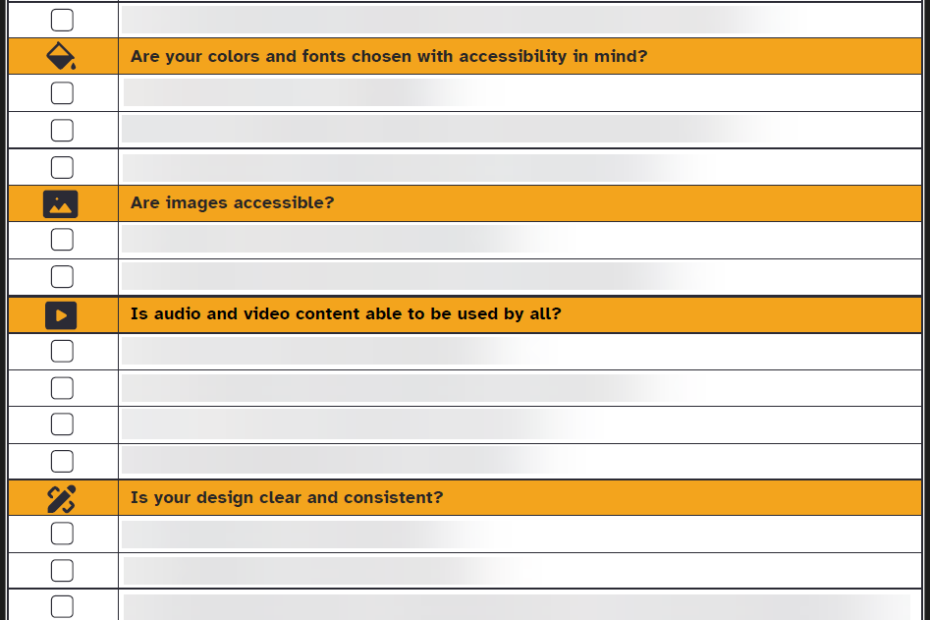
Accessibility for Online Learning Checklistby Britne Jenke, CPACC, CPTD, SPHRJanuary 5, 2026January 5, 2026
Transcript: Making News Accessibleby Britne Jenke, CPACC, CPTD, SPHRDecember 15, 2025December 15, 2025
What’s the Difference between Accessibility, Usability, and Inclusion?by Britne Jenke, CPACC, CPTD, SPHRMay 18, 2023August 4, 2025